I recently came across one of the best SaaS homepages I’ve ever seen when it comes to conversion-led copywriting and UI.
I’m going to break down each section so you can take inspiration and apply the principles to your SaaS homepage, which will rocket your conversions.
Most SaaS homepages suck (I should know, I’ve audited 189 this year). No offence, but the odds are that yours sucks too. This will be a key reason why your website is not converting as much as you’d like it to.
Let me break down RevenueHero’s homepage, which will give you the blueprint for more leads.
Benefit and objection handling headline
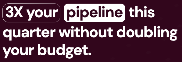
When I saw this headline, I immediately thought, “That’s one of my favourite headline formats!”.
[goal] without [objection]
It ticks all the boxes
- Fewer than 10 words
- Statistic (3x)
- Client goal (3x your pipeline)
- Timeframe (This quarter)
- Objection handling (without doubling your budget)

Your homepage hero headline is the most important digital real estate in your whole marketing department. If you spend 10 hours coming up with a headline as good as this, then it will be time well spent.
Easily digestible above-the-fold copywriting
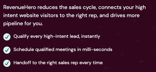
Many SaaS websites use paragraphs of text to try to describe their products and benefits. Most homepage visitors don’t read. They skim. Use single sentences and bullet points to make it easy for your visitors to consume it.
Clear call to action with a mini description

I love the little callout.
- “30-minute” – Letting you know that it’s relatively short.
- “Personalised to your business goals” – Making you feel special.
Other examples of excellent callouts on CTA buttons are “No credit card required” for Free Trials.
Facts and stats

Facts and stats are psychological wins in marketing. We find it easy to imagine the impact these statistics would have on our own business.
Go through your case studies and interview your customers to extract the best stats to promote your product.
RevenueHero has put these stats on their site without any context. So, they are not offering any guarantees.
Problem section
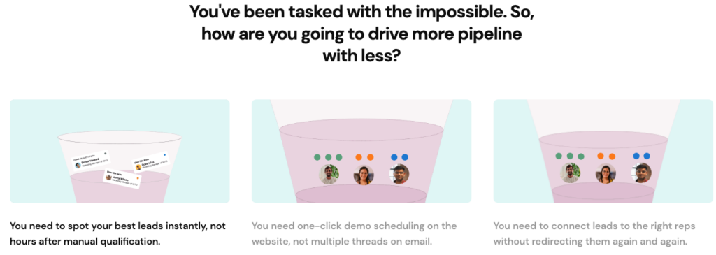
Most SaaS homepages miss the Problem Section, which is an excellent way to connect with your visitor on an emotional level.
RevenueHero has identified these main problems that their prospects have and greeted a whole section on their homepage to address them.
- Spotting leads too late
- Multiple emails for booking demos
- Redirecting leads multiple times
It’s difficult to connect with your visitor when you only talk about yourself and your product/service. If you outline the problems that your visitor is feeling, they will immediately think, “Yes! They understand me!”.
Simple, clear graphics
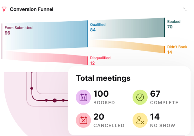
Too many SaaS homepages have ugly, boring and hard-to-see graphics. Don’t just copy and paste a screenshot of your software… please!
Take inspiration from the above. Simplify the product, pump up the font size, and use icons, charts and stats to simply explain the benefits.
Does-what-it-says-on-the-tin copywriting
I hate buzzwords and clever brand slogans that no one understands. Keep it simple. So simple that a child could understand it. Here are a couple of great examples from this homepage:

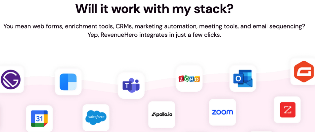
Objection handling (integrations)
RevenueHero ask a common question in their headline: “Will it work with my stack?”.
Speak to your sales team. What are the most common objections or questions they are being asked? Address it on your homepage.
Social proof
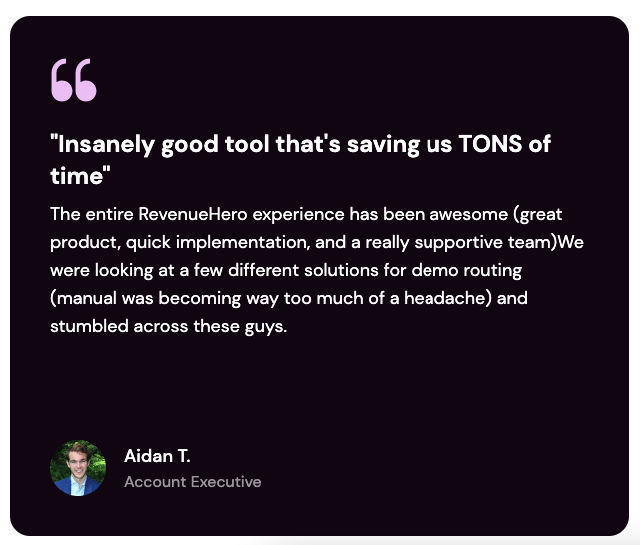
You can’t have an awesome SaaS homepage without social proof. There are an impressive 12 testimonials in a carousel on this page.
What is the page lacking?
This is an awesome homepage. Props to RevenueHero! There is always room for improvement. The page would benefit from some case studies. A few more CTA buttons wouldn’t hurt.
Overall, I’ll give it a 9/10. Great work!

Free SaaS marketing strategies & campaign ideas in your inbox every Thursday
Receive actionable SaaS marketing ideas to implement in your business


